Tuesday 17 October 2017

Rationale/Reflection


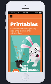
Our event campaign is a magic show hosted at the Hannah Playhouse. It's a charity event to raise money to bring back the Downstage Theatre. Our aim was to target children between the ages of 3-10 to inspire the young generation to take an interest in the stage and help revive a culture of live theatre lovers. The narrative that runs throughout each touch point of transmedia begins with the poster. The poster acts as the first encounter with the event to 'spark' interest in the event and the theatre. This is then followed up by the website which works as a constant that exists before, during and after the show. It is the host for the experience the children encounter during the magic show. After participating in the event each child is given a sticker pack that allows them to 'become a magician' through learning the simple magic trick on the tag and proudly wearing their certified sticker. Key text such as the term 'spark', 'experience' and 'become'/'certified' enhances this growth across each touch point. Similarly, the bunny's appearance in each of these forms indicates each stage of the child's journey through facial expression and its interaction with props.


Website in Invision 


Mobile Layout 


Reflection

What was your favourite aspect of the project?

We really liked designing the character and figuring out how to translate it through each media. Overall, we enjoyed every aspect of the project. 

Your biggest learning? 

Learning a new programme to prototype in and making sure to have a consistent style throughout. 

What would you change or do differently?

Attempt to translate our designs in more forms of transmedia. 


Week 6

This week was focusing on transferring our desktop website to mobile device format and refining out posters and stickers for printing. To fit the mobile format, We moved the imagery in the homepage so that the imagery and text both fit in the screen and made the buttons bigger. We also added a coloring page in the printables section. Initially, we had icons but then removed them because it would be too much imagery.


Sunday 8 October 2017

Week 5 - Interim

For interim, we presented our poster, website and takeaway item.


Website in the Invision app.


Stickers and cards 


Feedback

  • Our designs are clearly for family and kids.  
  • Website is cohesive and clean. Could make things more cohesive by having round buttons and same title font  
  • Could make a goodie bag for the kids to put the stickers and cards in. 


Wednesday 4 October 2017

Week 4 - Website wireframing


Monday - Today's lesson was about website tools for developing our website. We learned about grid systems, what screen size to use for the desktop layout and the invision app.

Thursday - We printed what we have so far of our website and poster got some helpful feedback on how we can strengthen our poster and how all touchpoints could be more cohesive. We decided to have the bunny as a key character throughout the website by integrating parts of him with different positions and expressions. Instead of 'light up their imagination', we went with 'spark up their imagination' and include sparks coming out of the hat. For the website, replace the title to 'Experience the magic'.

upload wireframe


Week 4 - Poster developments

Continuing the idea of 'light up their imagination'


We decided to have a logo that we can place in each of our touchpionts to tie it all together. 


Thursday 28 September 2017

Research - Transmedia examples

Some transmedia examples with an illustrative style. We like how these are simple yet effective.


Wednesday 27 September 2017

Research - Websites examples


Examples of websites with a kid-friendly appeal.

http://www.cupsannual.ca/


  • The animation of characters and fishing hook across all pages makes for an interesting website. 
  • Consistent fonts, illustrations and aesthetic. 
  • Easy to read and navigate 


  • These web pages have bright colours with a fun and happy mood which makes an impact on the child's mind. It draws their attention and will make them want to return to the web page. 
  • Fun characters/figures to reach out to children 
  • quirky lines and shapes

Looking at the TV programs kids watch and web pages. 


Other websites that have good FADPs. They don't necessarily target kids but feature a clear grid layout (images and type).

http://www.kikk.be/2017/en/about